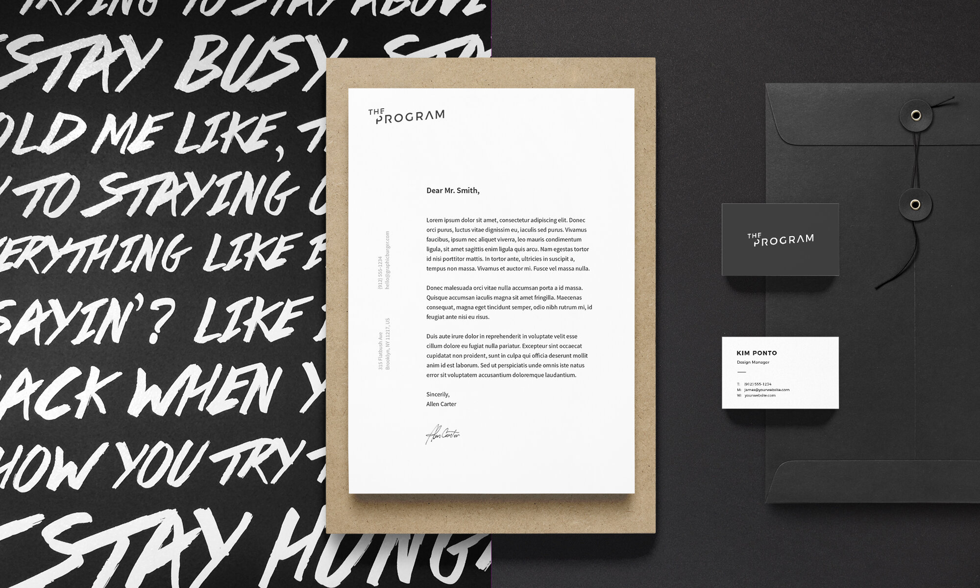
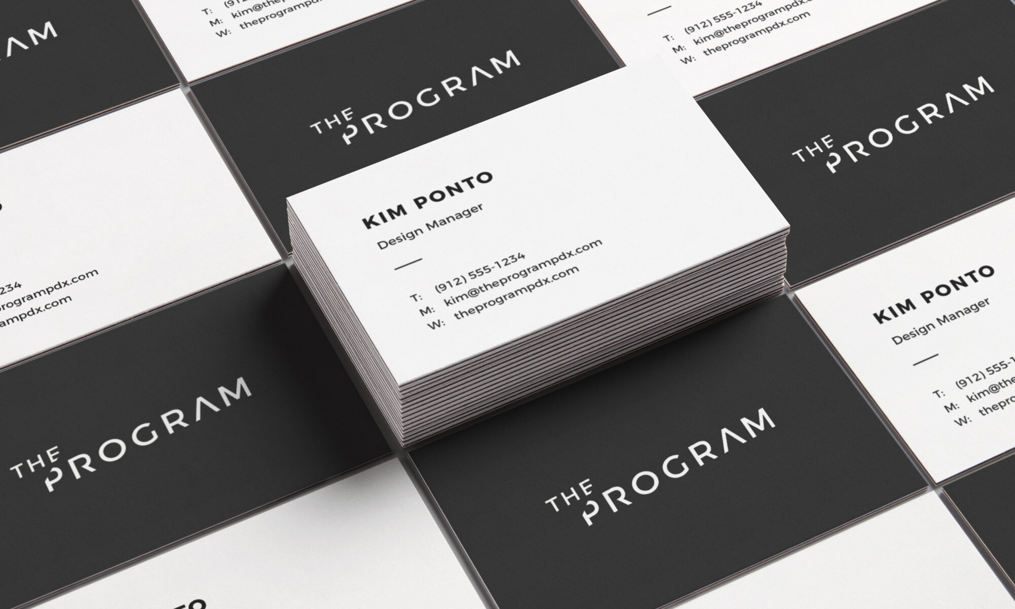
I was tasked with imagining a new identity for The Program. They wanted something that better reflected their progressively digital stance on all things Advertising. The identity needed to encapsulate all facets of their expertise, from original video content to product rollout strategy. By keeping things minimal with a playful twist, I believe we landed on a timeless mark that represents all sides of The Program’s capabilities.
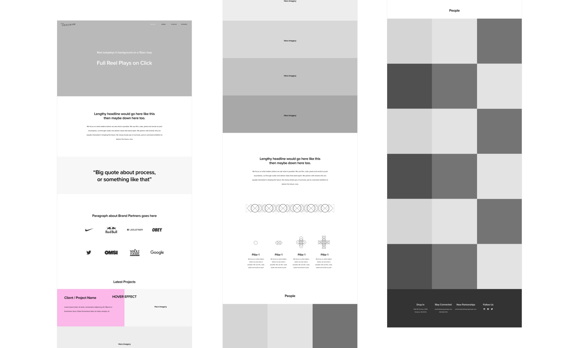
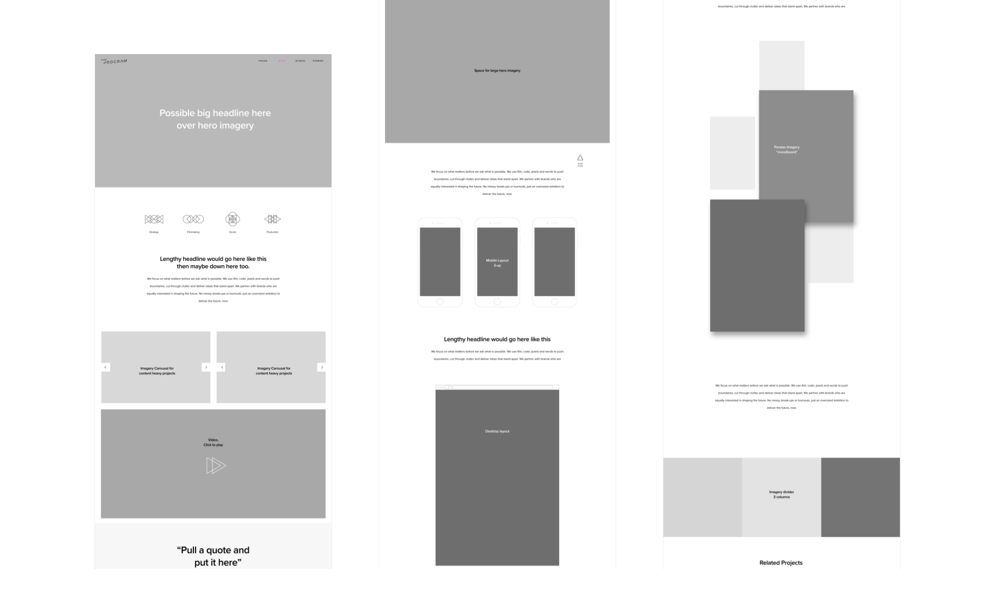
The next step in the identity process was to apply the updated look to their web presence. You will see that towards the end of the project, or you can just check it out live on the internet right here!
The Program
I strived to create a logo that was cinematic, playful, refined yet not corporate. Timeless yet not austere. All the completely non-opposing and attainable things people want from a logo! I think I at least got close to that ideal.
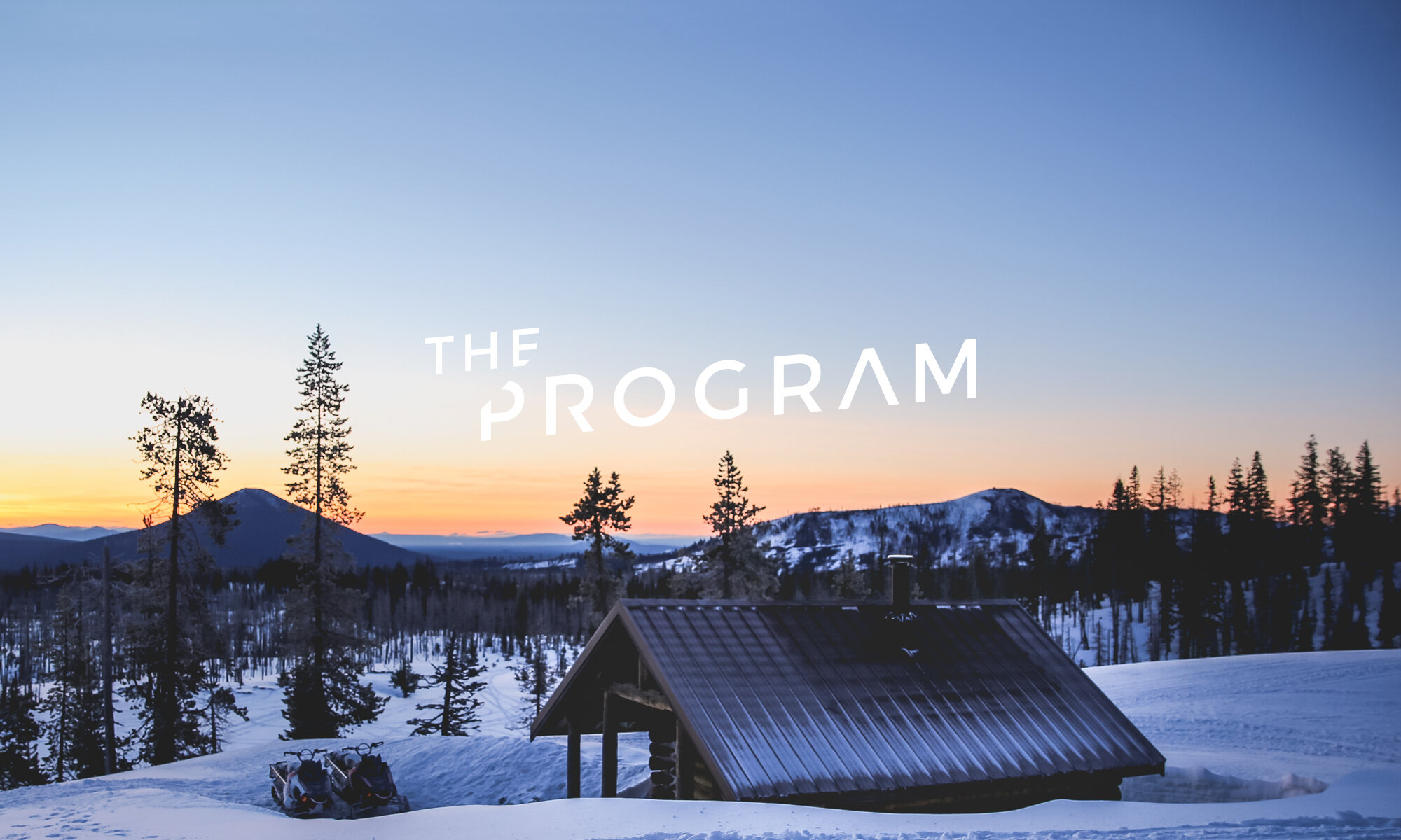
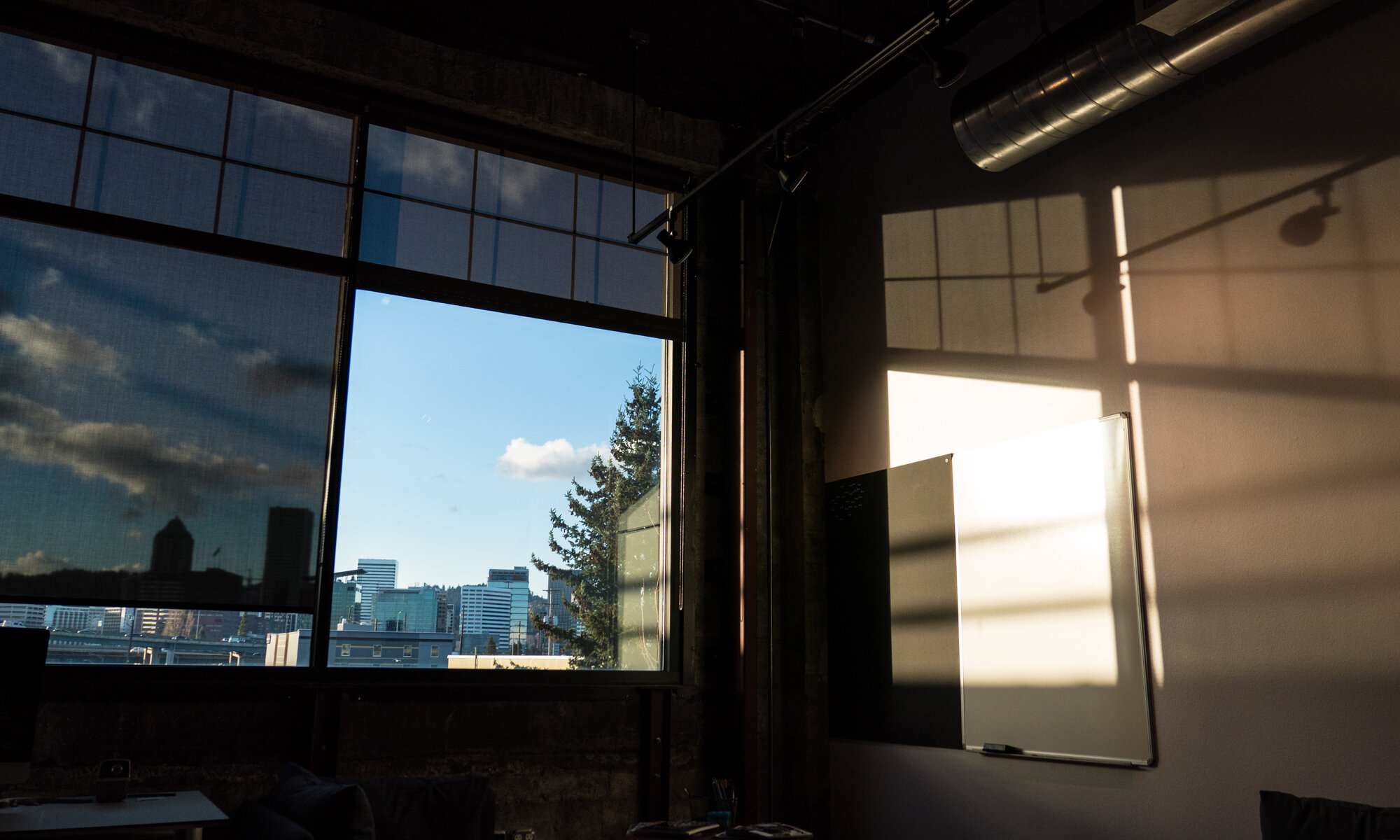
The below photograph is from the office, and in a small way helped to influence the aesthetic and structure of the logo. I also just really love the light.
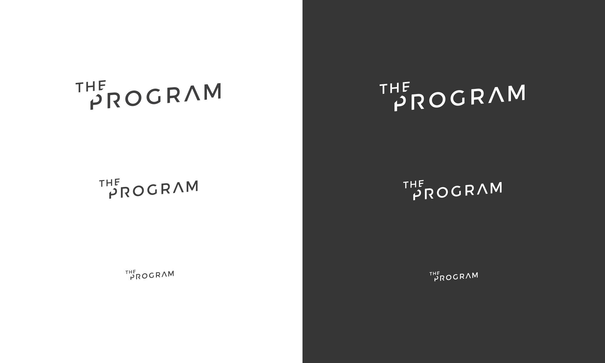
It was important to the client that the logo work at all sizes on screen or print, as any good logo should. It needed to be legible at a very small size, yet also embody a appropriate level of detail when viewed large.
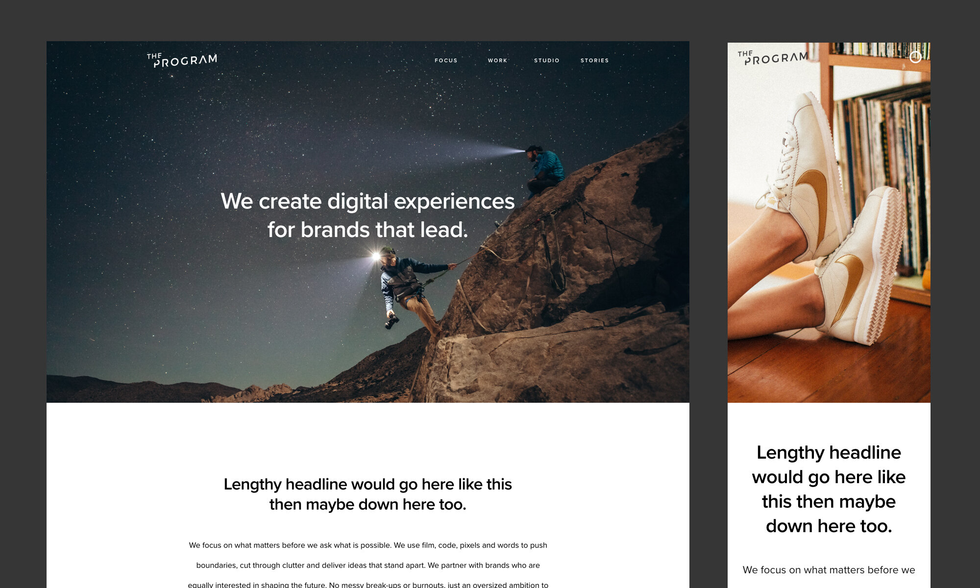

The goal was to keep the site very light and airy. Lots of white space to break up the beautiful mainly photographic content. We wanted to give things plenty of space to breathe. By taking this approach, each project felt important, and the user could more easily appreciate each moment without too many things competing for their attention.